Seattle Sonics Rebrand (2025)
Branding Identity | MArketing | Sports
Brand Development
Strategy
Visual Identity
Copy Writing
Guidelines
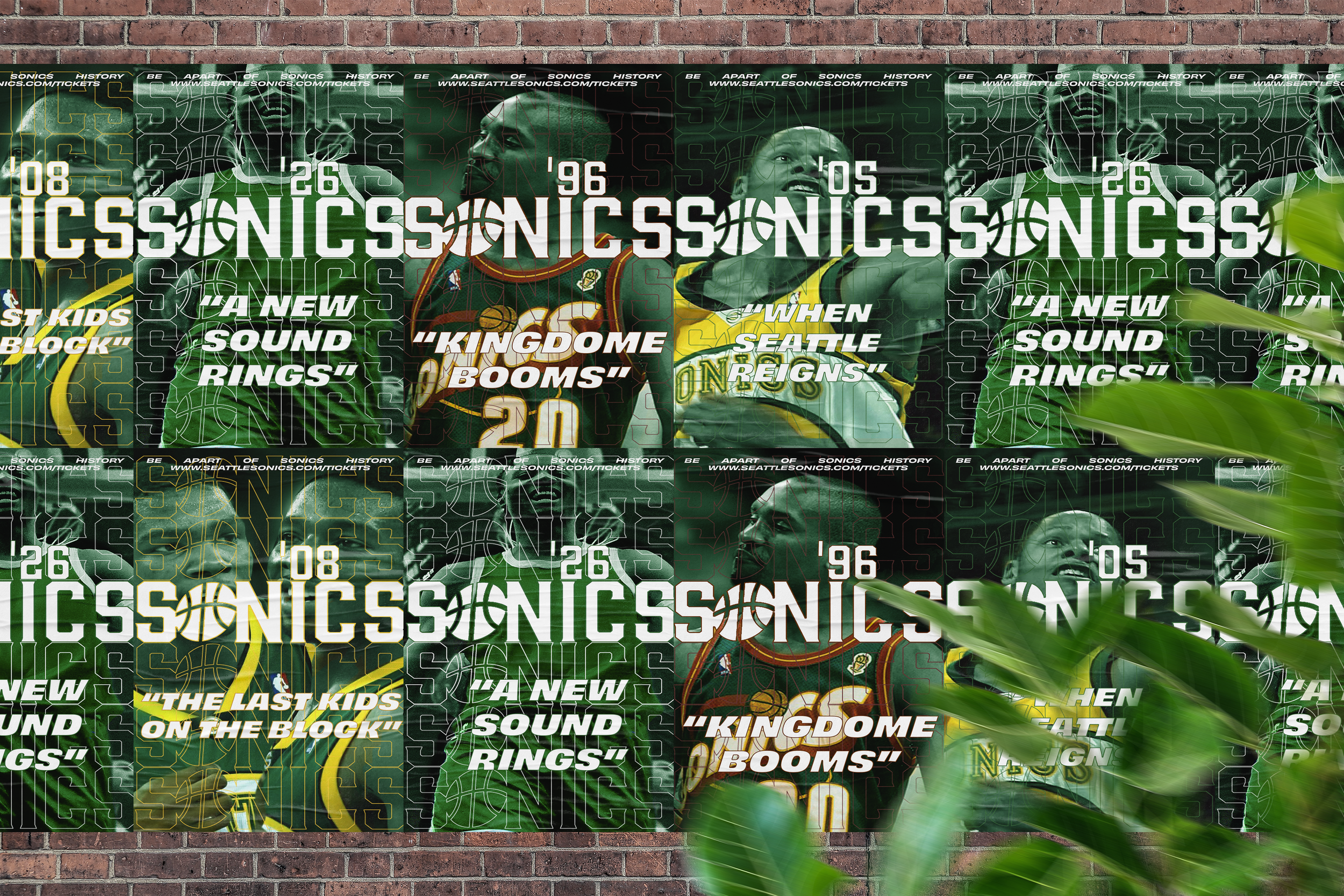
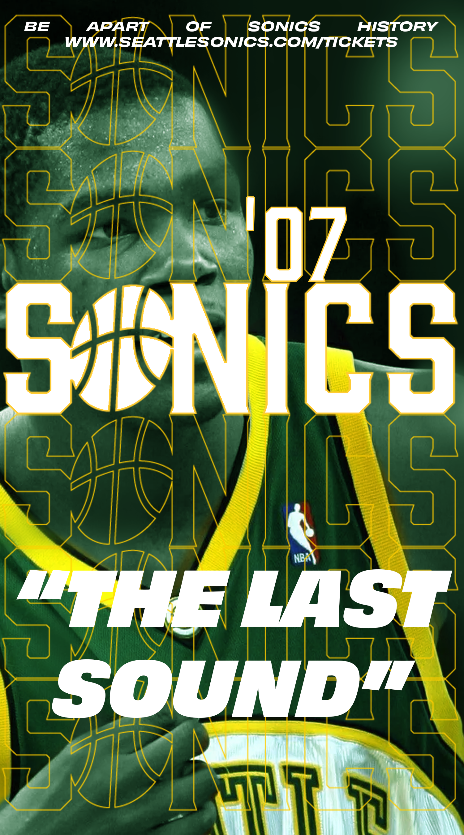
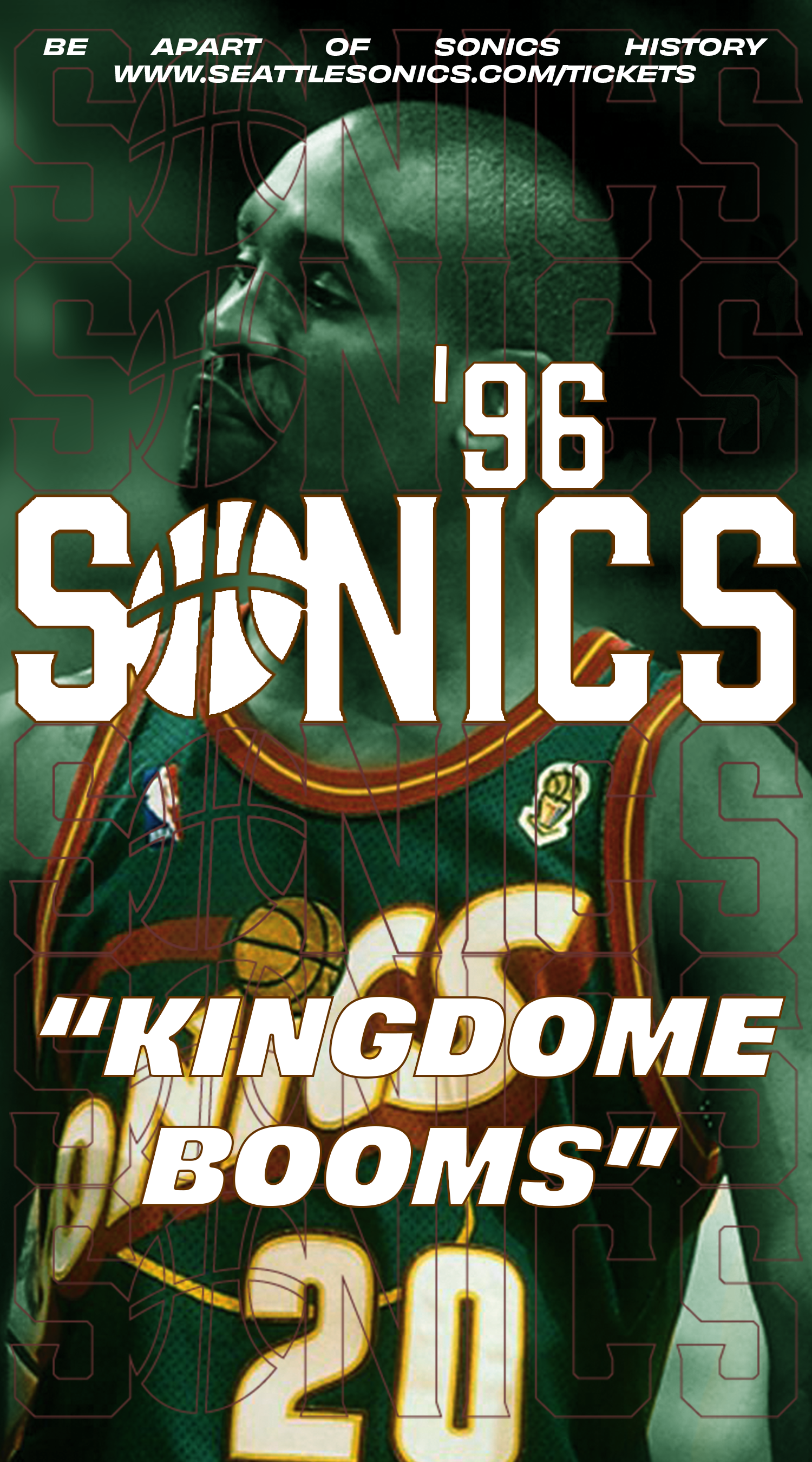
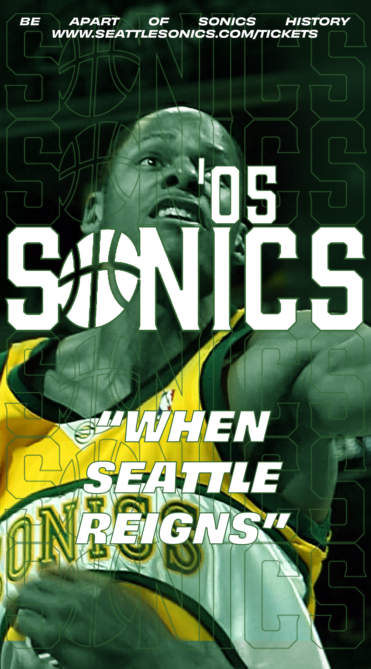
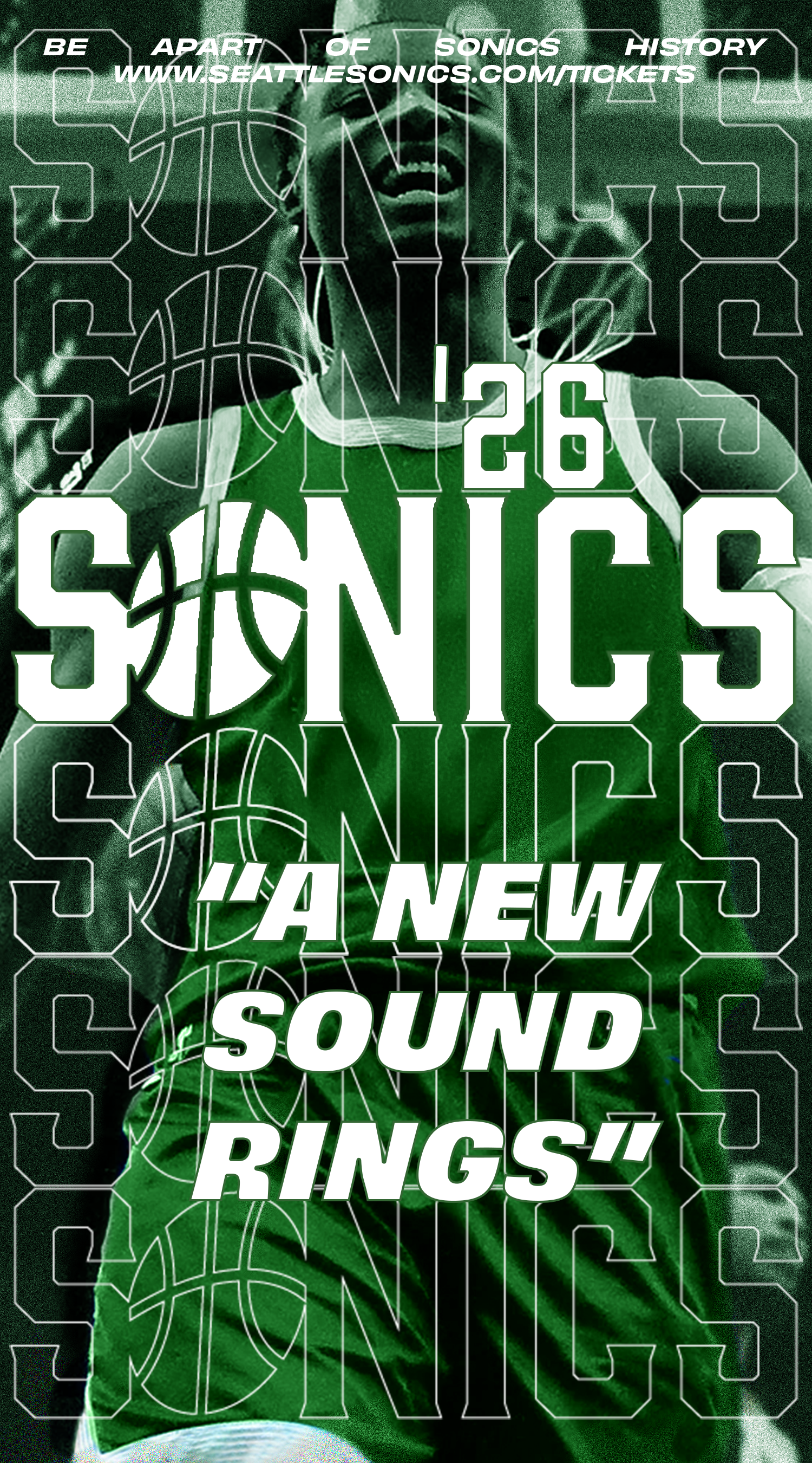
Seattle has been without an NBA team since 2008. With hopes to an expansion of the NBA, the Sonics are looking to return. As a whole generation of fans have gone by without having a home team in Seattle. The people are excited for their sonics to return and its important for the brand to reflect the excitement to the fans.
The sonics as a brand
The Sonics have been gone from Seattle for nearly 2 decades. To welcome them back to the city, it’s important to make sure everyone is included to the new found success and enjoyment the Sonics will bring. Since 1967 the Sonics have been accumulating fans and through the generations, the fandom has been passed down. The excellence of the NBA has been shown through it’s longevity and oldest standing teams like the Blazers, Lakers, and Celtics, which is why we should embrace coming back like we never left.

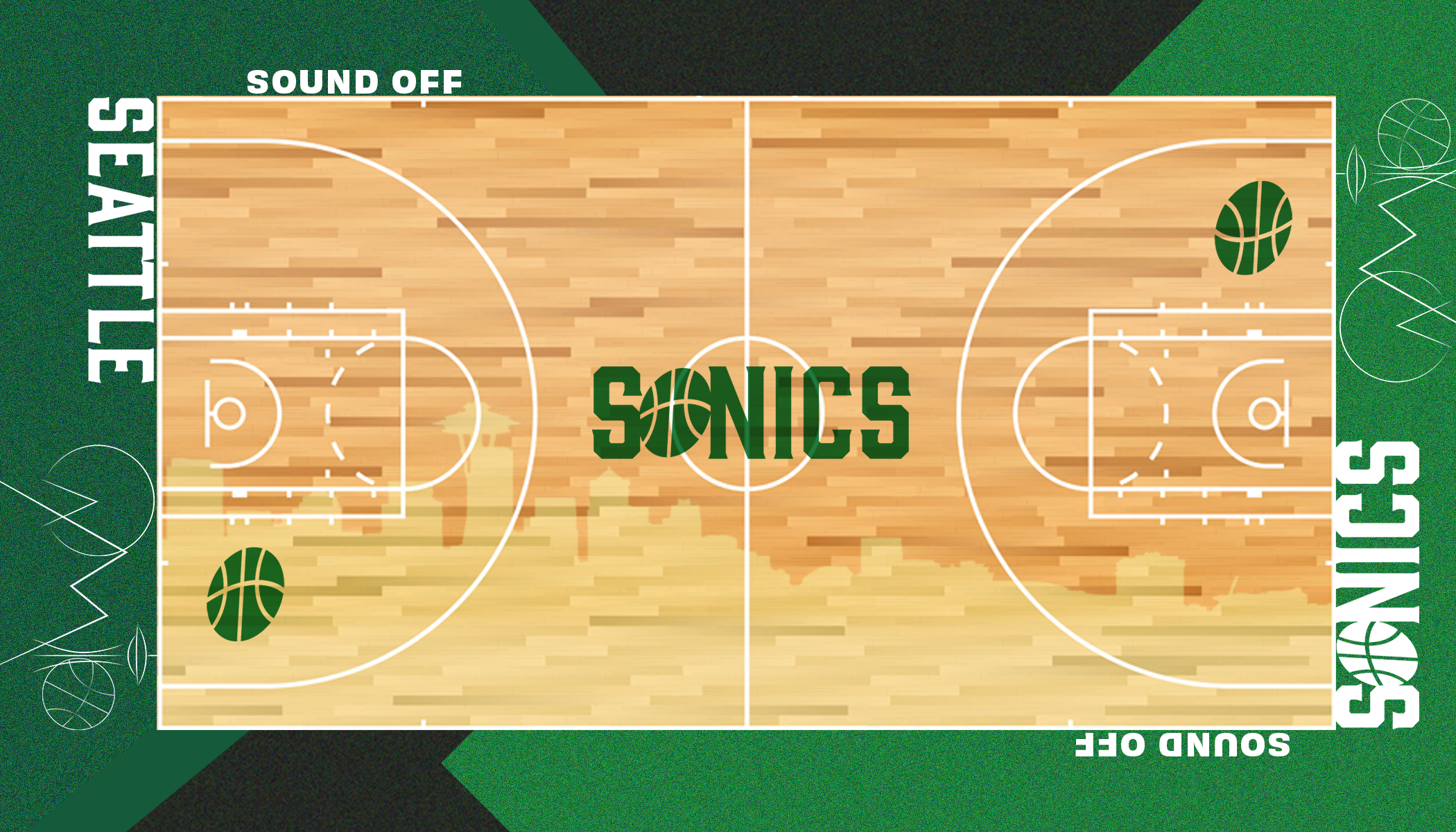
The MEssage
The city of Seattle is one of arts, nature, and infrastructure. They are resilient and their NBA team should reflect that as well. We want to draw inspiration from Seattle’s heritage and create feelings of excitement to bring in both new fans who have never been to an NBA game and older fans who still remember how the Key Arena would erupt as Ray Allen would splash in another three.
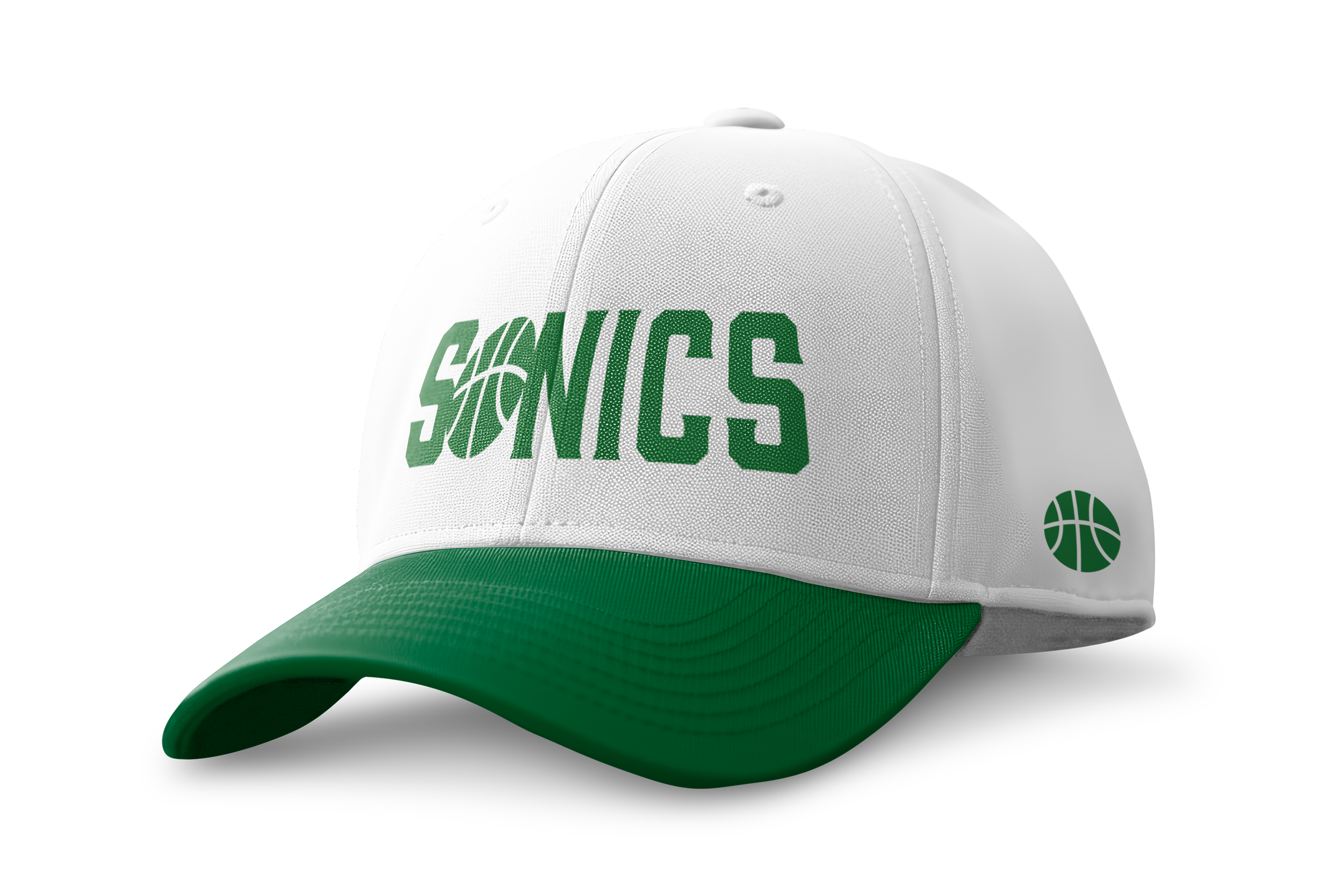
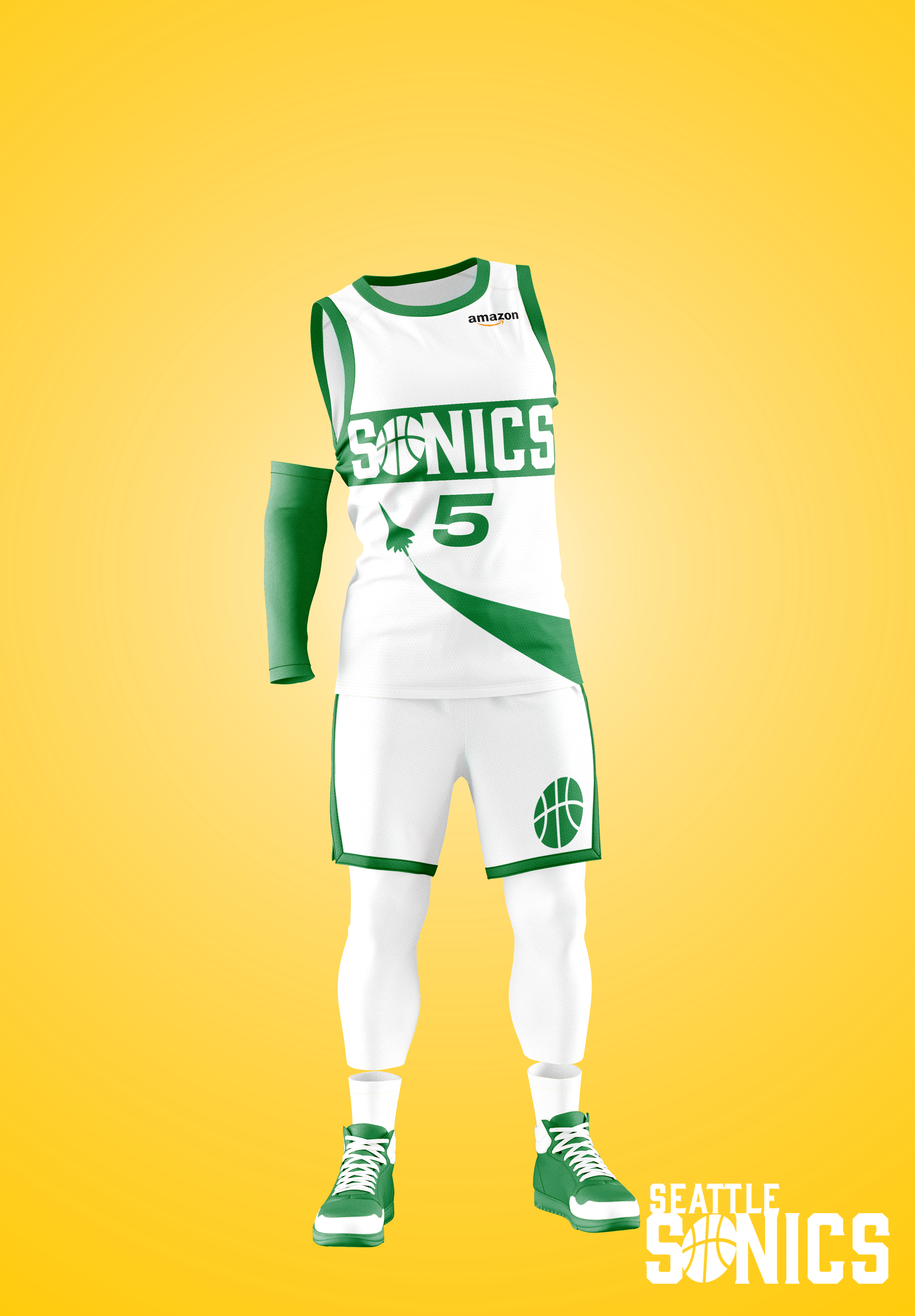
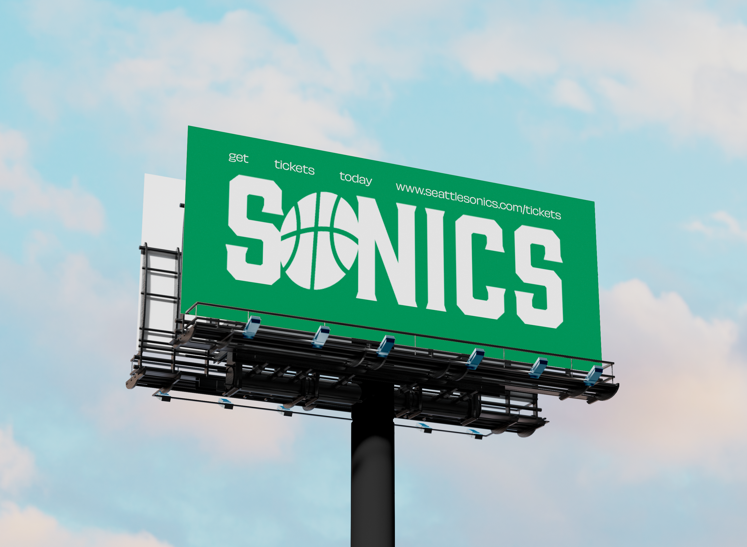
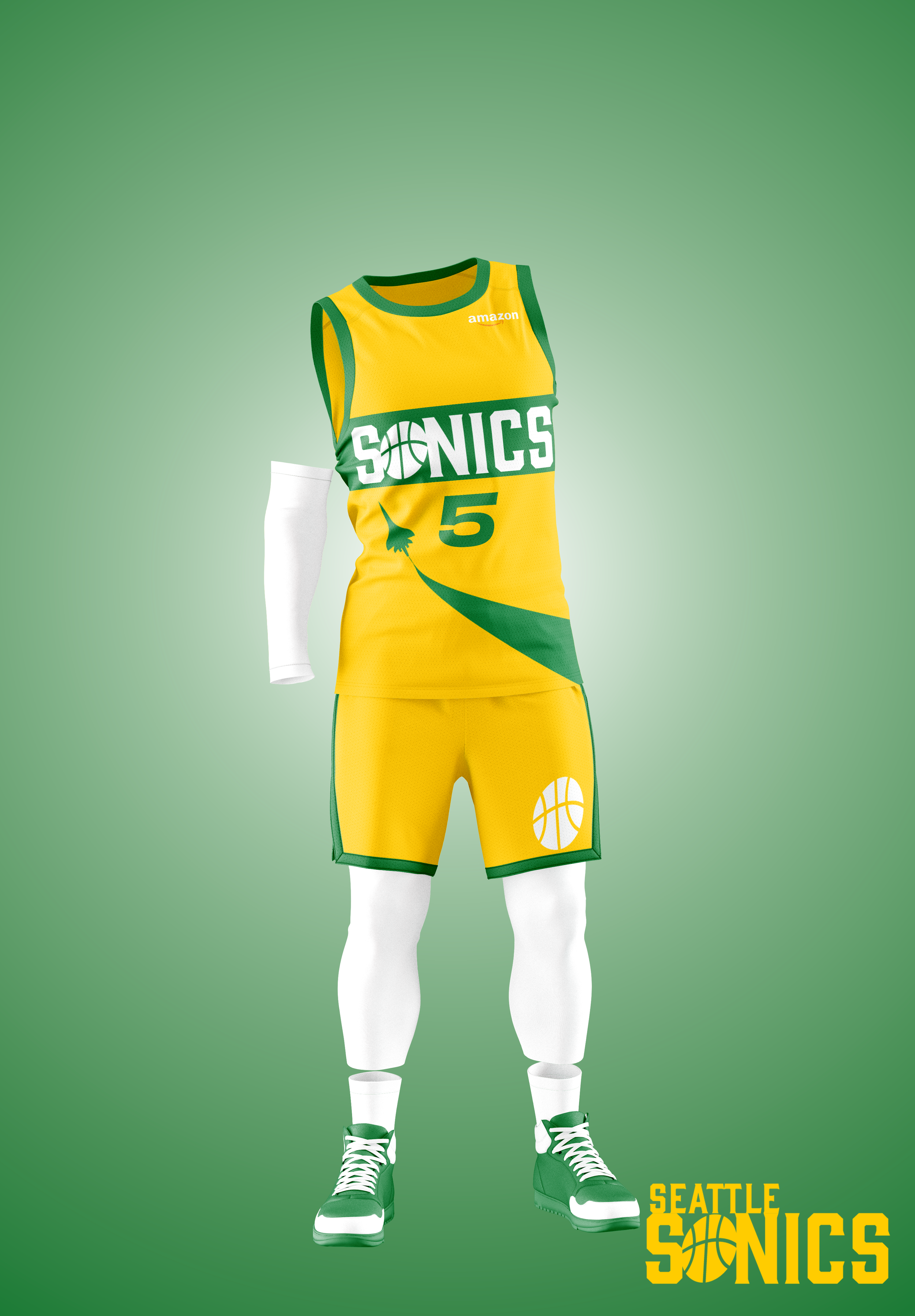
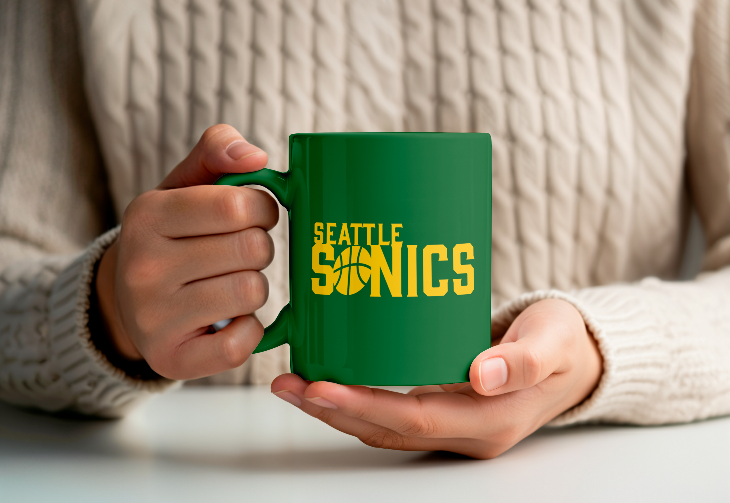
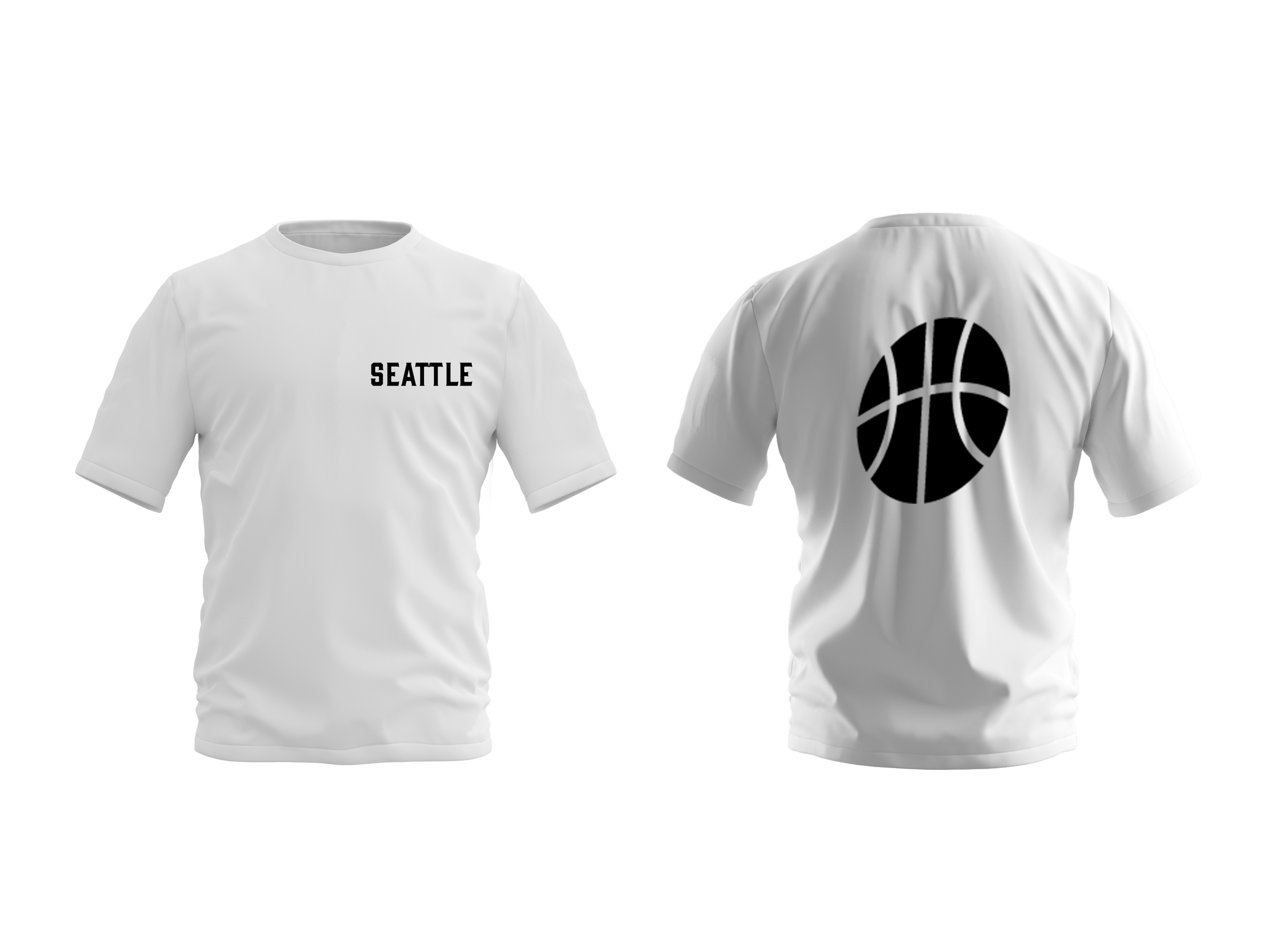
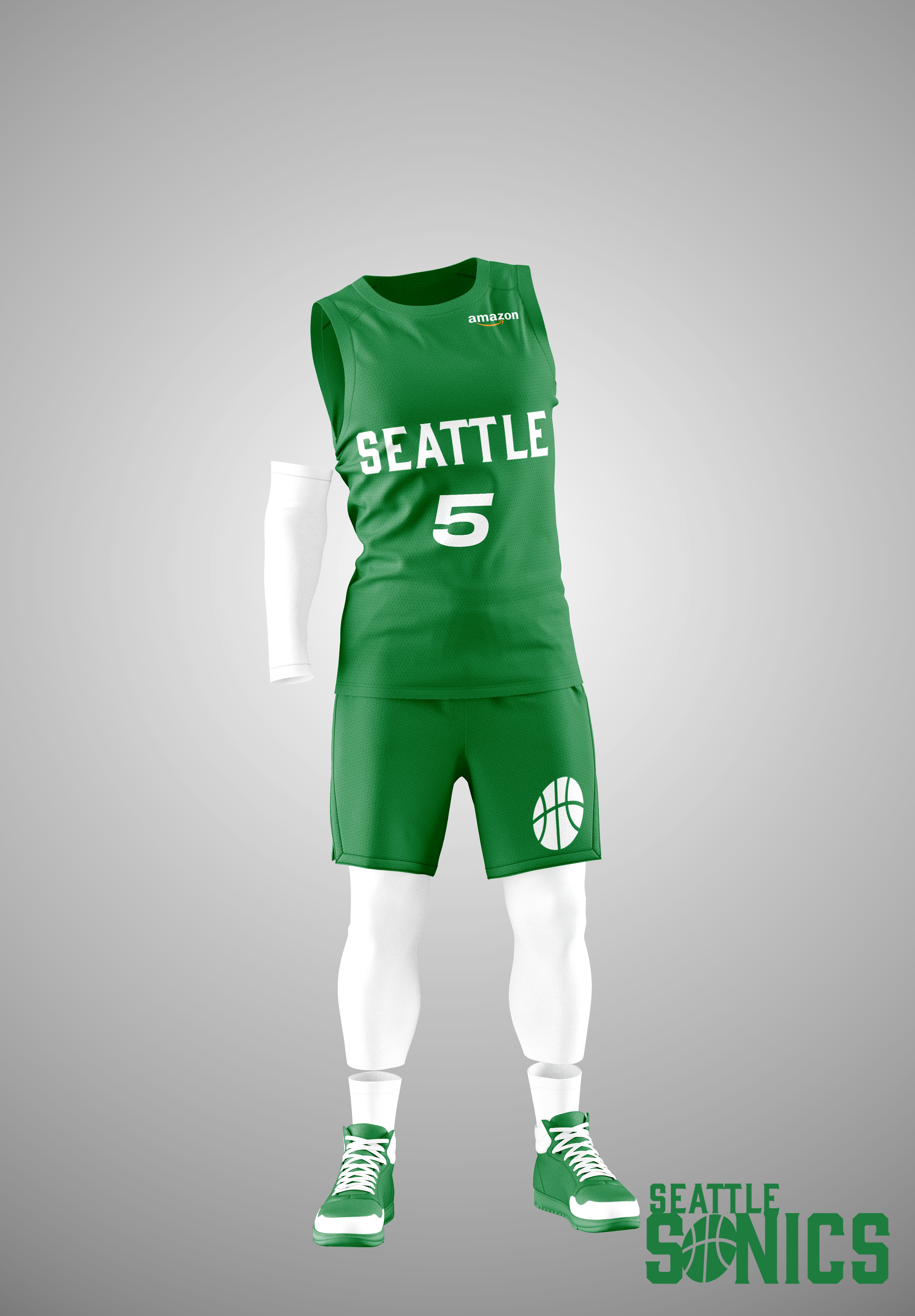
Logos
Global
The new Sonics logo uses a Slab Serif style typeface that creates a bold statement across the NBA landscape. This Logo is a wordmark that includes a basketball icon. The global includes all elements of the logo. The icon and separate wordmarks are used for short handed logo uses such as marketing and specific broadcast needs.

Icon

City Wordmark

Wordmark